Quickwork
Simplifying Onboarding
Experience for New Users
Quickwork
Industrial Design Project
Quickwork is a company based in Mumbai that aims to simplify work through integrating apps to build automated workflows.
Role
As a UX/UI Designer, I worked with a team of four designers on a 4-week project for the redesign of the website going through the Design Sprint process.
Tools: Figma, Miro, Google Workspace
Overview
The company wanted to increase their number of active users by simplifying their platform through providing more accessibility and a lower barrier of entry to non-coders, business developers, and other professionals inexperienced with automation platforms.
Problem
It seemed most users who entered the website were faced with a lot of information that could be overwhelming for a first time user. Even with the helpful tools the website could give, users struggled to discover what exactly the website can offer due to the complex terminology and information explained throughout the site.
How might we simplify the onboarding process for first time users?
Solution
The solution was to redesign the company’s website to promote sign-ups and create a simplified version of their onboarding process so users can successfully complete their first automation.
The Process
My team and I followed this process through the course of four weeks.

AUDIT
The first step in the process was conducting an audit on Quickwork’s existing product, which was broken up into three levels:
-
Website
-
Automation Platform
-
Conversations Platform
Audit Report
-
Website
The audit report began with an overall summary and high-level recommendations. The audit was an initial introduction to Quickwork’s platform that was meant to be relatively quick, performed over the course of a couple days.
I took the time to navigate through the website and began my audit of Findings and Recommendations.
Finding-1: Menu layout and design inconsistency across pages.

Recommendation: Keep users focused and interested on their task by keeping all pages from the website the same.
Finding-2: The way of using technical terminology makes it difficult to comprehend fully what the website offers. Webpage lacks to speak the language of the target user base.

Recommendation : Use words, phrases, and ideas that are familiar to targeted audiences, and avoid tech terminology that few really understand. Reassess how much your visitors can understand the interface and the product.
Finding-3: When browsing, it’s difficult to locate where you are when on the website. No clear indication or reassurance if you are on the home page, platform etc…

Recommendation : Provide some location indicator that could possibly be lit up or colored to let the user know what page they are currently on for that reassurance.
2. Automation Platform
Automations can be a lot easier to use through a helpful onboarding process and a better way to always guide users through the experience.
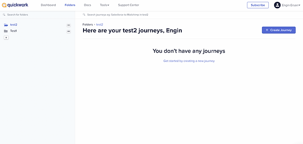
Finding-1: The first action after sign-up is to Name the Folder, which feels out of context. What is this in regards to? What is the folder for?

Recommendation: Adding a quick explanation or a hover link explaining what the folder is for. To be clear is a better way to start the experience.
Finding-2: I don't have any journeys at first, and the action is to create the journey. What else can be here? So far all you see is a blank slate which can be overwhelming for a first time user on what to do first.

Recommendation: Already having potential journey templates and resources on how to set up a journey can be helpful.
Finding-3: Currency, there is a “Docs” page, but it's just pages and pages of text that people aren't going to want to read.

Recommendation: Already have the documentation built into instructions with the initial set up so people don't have to take that extra step of “reading the manual.”
Finding-4: The UI is misleading, for instance - the save changes v. save & start button. What does Start mean, start creating the journey or start the journey? Also, save changes looks like it’s greyed out, making it not look clickable.

Recommendation: UI needs to be more simplified with better clarity.
3. Conversations Platform
My conversation findings were to provide a helpful on-boarding experience with recommendations on where to go first.
Finding-1: I accessed the conversations platform via the automations platform but was instantly prompted to re-sign up. Immediately, I thought this was confusing—do users need to have an additional login for Quickwork conversations?

Recommendation: I first tried by original login but it didn't work, so I assume that was the case. Instead, I think these should both be part of the QuickWork login.
Finding-2: After signing up, the first view after sign-up is very blank and it is unclear what to do. In addition, at least on the automation platform there was a CTA to create a new journey. Here I have no idea what I'm supposed to do, and after exploring all the options it is still vague.

Recommendation: I believed it would be a more delightful user experience if they were guided through everything to make it easy and as quick as possible.
Summary of Audit
The audit was well-received by the core Quickwork team. From here on out, our team of five decided to split up into two groups to redesign the (1) website and (2) automations platform. I offered to work on the website with two other designers, since I was interested in redesigning the users navigation.
As the timeframe was only three and a half weeks total for the entire project, we decided that it would be best to just focus on the website and automations, omitting the conversations platform which needed more development.
RESEARCH
After the audit, the Website team decided to conduct research to better understand and find out how other companies are getting first time users to interact with the site and become return users.
The secondary research included investigations into what a citizen developer is in order to better understand the user.
User Persona
I believed it would be helpful to conduct interviews with their audience to determine what sort of language most resonates with them. The current website contains a lot of technical jargon that may not be easily understood by non-coders.
Creating the target users helps us know who would use this and how much knowledge do they need to understand the platform.
User Persona 1: Citizen Developers (Primary Persona)
-
Business developers unfamiliar with coding
-
Needs simple automations with zero anxiety
-
Wants to solve business problems
User Persona 2: Coders
-
Developers who don't really read all the marketing jargon
-
Familiar with coding
After exploring their personas, we determined with the core Quickwork team that it would be more useful to pursue the recommendations based on citizen developers.
Lightning Demos
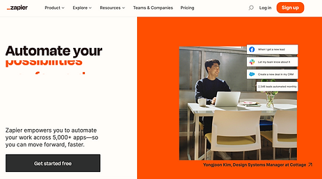
Next, I conducted lightning demos to determine what ways other competitor's websites engage first time users and how they encourage them to interact.
Competitor A

Things that I like about it
-
An accessible navigation bar that keeps everything organised
-
Easy headline to understand what the site offers
-
Offers more than one way to sign up
-
Drop down menu available
Things that I don't like about it
-
Nothing example of their automation shown
Competitor B

Things that I like about it
-
An accessible navigation bar that keeps everything organised
-
Easy headline to understand what the site can do
-
Encourages interaction by starting an account
-
Dropdown menu available
Things that I don't like about it
-
No search bar
-
Lack of interaction for user
Competitor C

Things that I like about it
-
An accessible navigation bar that keeps everything organised
-
Easy headline to understand what the site can do
-
More than one option to get started
-
Dropdown menu available
Things that I don't like about it
-
Some UI inconsistency (font size, words, button sizes)
-
No automation example shown on landing page
MAP
As our team understood the landscape of competitors a little better, this helped inform our design decisions and overall mapping strategy. We uncovered valuable opportunities and inspiration to create a new and improved design for Quickwork's current site.
User Flow
Based on the goal of creating a more delightful user experience for a first time user, I created a potential end-to-end experience model of what the user would see right when they enter the landing page of the website. Giving a Welcome model gives the user choices instead of figuring out the site completely on their own.
User flow helps us figure out the flow of a website after you've thought about the customer experience and user needs. To best understand these needs and the experience you want your customers to have, it's important to map and visualise them.

Site Map
Before my team continued on what we wanted to continue our goals with the website, we created a sitemap to help clarify what our site's goals are before we start designing or creating content.
This allowed us to plan for usability, so when we start to redesign the website this helps us simplify, trim off unnecessary pages, and keep what's important.

Crazy 8 Exercise
From here, we decided to do a sketching exercise to generate many ideas. It is a fast sketching exercise that challenges people to sketch 8 distinct ideas in 8 minutes.
The first sketching exercise I performed solo where I created 8 potential screens that the user would see when searching.


REDESIGN
Wireframe
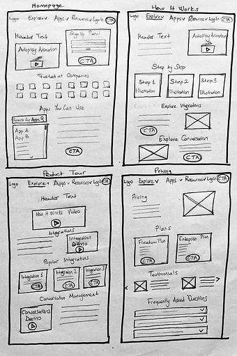
From the sketches, I began wireframing and the team completed with some editing. On a tight deadline of a week and half to complete wireframes, high-fidelity mockups, and user testing, we decided to focus on making detailed wireframes to prepare for high-fidelity.
 |  |  |
|---|---|---|
 |  |  |
High-Fidelity Mockups
From wireframes to high-fidelity mockups, the main change was to bring in the UI consistency and organised structure throughout the site.

REDESIGN
I had the opportunity to conduct the usability session with three people.
-
Background colour choice
-
Users were suggesting backgrounds have a little more pop of colour to keep the interest of the users.
-
-
Insert real app examples for the welcome user modal
-
It was noted that the welcome modal should have real apps shown so it gives it that full complete look.
-
-
More examples of Quickwork's automation
-
Another user wished there were more examples of the actual automation, like a"sneak peak".
-
-
Integrate the logo more
-
One user thought the clock logo should be interacted with the automation so it makes sense having it.
-
In the final round of user testing, we received positive feedback on the prototype, which you can explore below.
CONCLUSION
After presenting designs, Quickwork was very pleased with the deliverables, including the audit and redesign.
Overall, it was an enlightening project to work on, with two teams across 6 time zones and was a valuable experience to work amongst a design team under tight deadlines.


